For me, one of the most exciting features of Superman’s comic strip adventures would occur when he travelled into the Fourth Dimension to visit his parents Lara and Jor-El on their planet Krypton.
He would emerge into a fantastical urban utopia, revealing wondrous, strangely contorted, soaring buildings intersected by a labyrinth of organically fluid superhighways in the sky.
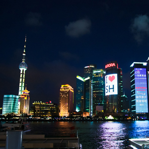
Back on Earth, you can see the real-life version of these futuristic cityscapes in several rapidly developing cities, such as Doha in Qatar, Singapore and the Pudong district in Shanghai.
But all too frequently there is a disappointing mismatch between the exterior flourish and the interior spaces.
Once you progress beyond the public circulation zones to reach the office tenancy spaces of British architect Norman Foster’s Swiss Re building in London (better known as “the Gherkin”), you will find uninspiring interior environments lacking the grandeur created by the exterior.
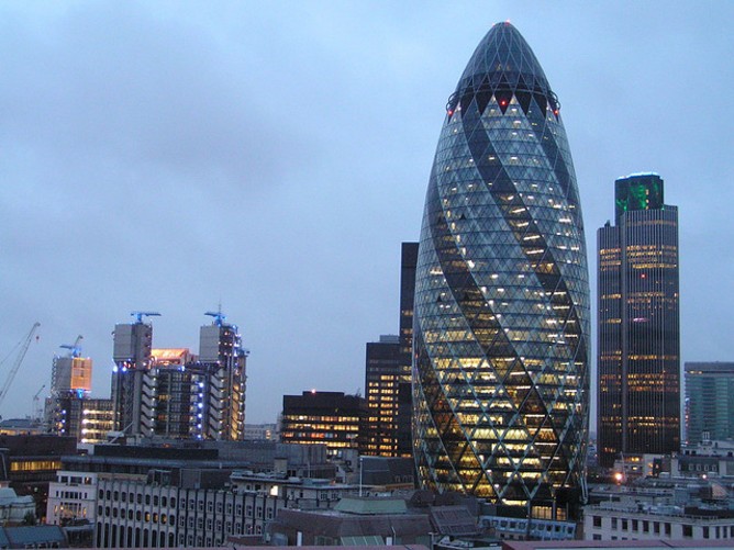
The exterior of London’s Gherkin building. John Keogh
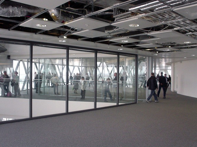
It’s like a reverse TARDIS: excitement generated by the building’s external shape is so often crushed internally.
Transforming the exterior
Why, then, are the interior spaces of these expressively extravagant buildings often rather underwhelming?
Throughout the majority of the 20th century, architectural concept sketches, models and working drawings were still produced using pen and paper by highly skilled hands.
With some notable exceptions, this modernist architectural period produced the simple, repetitive and undecorated barefaced buildings so famously reviled by Prince Charles.
This manual process was prevalent in architectural practice up until the early 1980s when CAD (computer aided design) was gradually adopted. Over the next 20 years, innovations and improvements to software were transformational. The method of designing a building evolved from a cumbersome two-dimensional process into a tantalising three-dimensional exploration.
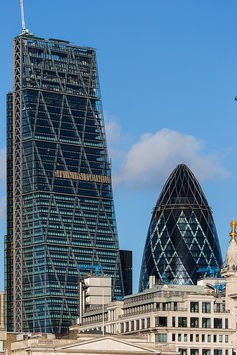
London’s “Cheesegrater” building (left) and “Gherkin” building (right). Michael Garnett
More recently, the CAD system of design and documentation has led to a fundamental change to the appearance of our cities. It has become plausible, at least, to now design and build complex and non-repetitive buildings without incurring prohibitive additional labour costs.
Superman’s home city is finally being built – all around the world.
Twisted, contorted, dynamic building forms are emerging that sometimes seem to confound gravity. An extravaganza of shapes is now appearing on our skylines. The skilled manipulation of 3D CAD software enables architects to achieve usable gross floor space within an enticingly sinuous, but build-able, envelope. Think of buildings such as the Quadracci Pavilion at the Milwaukee Art Museum, or the Galaxy Soho building in Beijing.
Office buildings, sports stadia, shopping centres, airports, transport hubs and sometimes hospitals are seen as opportunities for iconic cultural interpretation. Individual buildings increasingly become marketing tools of civic distinction. Building developers clearly understand this enormous potential for impact.
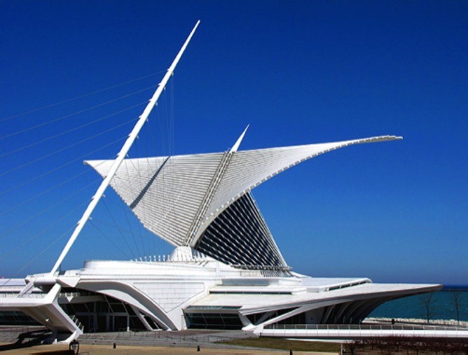
Quadracci Pavilion in Milwaukee. Creative Commons
London has “the Gherkin” (the Swiss Re building), “the Cheesegrater” (the Leadenhall Building) and the “Walkie Talkie” (20 Fenchurch Street). Shanghai has “the Bottle Opener”. Beijing has “Big Pants” (the CCTV building) and “the Bird’s Nest” (the Beijing National Stadium) and so on all around the world.
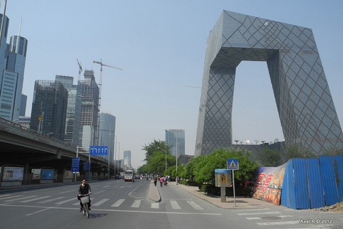
The CCTV Headquarters in Beijing, known as the “Big Pants” building. Axel Drainville
CAD, with its links to manufacturing and construction processes, has made possible this effusive architectural expression, at least externally.
The ground level lobby spaces often do manage to retain some of the external excitement but the interior working spaces, particularly in commercial office buildings, tend to lose this grand gesture.
Uninspiring insides
The internal activity – the very reason for the existence of the building – takes place in monotonous spaces that seem driven predominately by the need to accommodate workstation furniture and administrative functions in dire need of reconsideration.
Externally, architects have been liberated by their software programs. Internally, tenancy spaces seem absorbed in grappling with the impact of technology on workplace behavioural possibilities, at the expense of the interior environment as a whole.
There are several reasons for this external/internal disparity.
First, the direct links between architectural design, manufacturing and construction that have made possible these expressive buildings are often not applied when it comes to interior fit-out construction.
Second, there’s the issue of life expectancy. Nowadays a commercial building is expected to remain largely unchanged for 30 years or more, whereas the lifespan of an interior office space is five to 10 years. Non-repetitive, complex forms and shapes are expensive to produce in relation to the average duration of a commercial internal space.
Third, the focus of research and development in this sphere is predominately driven by the large workstation suppliers such as Steelcase and Herman Miller. Outcomes tend to be focused on modifications to commercial furniture systems rather than entire environments.
There are, of course, notable exceptions. The ANZ Centre in Melbourne’s Docklands, designed by the architectural firm HASSELL and built in 2012, demonstrates a refreshing reinvention of the way we can function in internal spaces.
During the past decade, a significant amount of research and reappraisal has been undertaken to examine how we work, the impact of technology and the workplace environment.Nevertheless, office interiors in particular are lagging behind the external architectural effusion.Perhaps Clark Kent could help us.
This article was originally published at The Conversation.
